Must-have features
Designing the right playable is key. Ultimately, you will need to enter the process with a test-and-iterate approach, to find out what works for your games and your audiences.
Here are some must-have-features to include and support when creating playable ad experiences. These are crucial for the performance of the ad, regardless of the type of playable you are creating.
We have also included a list of design guidelines which may help you plan and design your playable experience.
Don't forget to check out our free asset pack for all Unity Playworks Plugin customers to use in their creatives.
Portrait and Landscape support
To maximize the reach of your playable, it should support and be optimized for both portrait and landscape. At the very least, all game UI elements (such as buttons, text) should adapt and fit within both orientations.
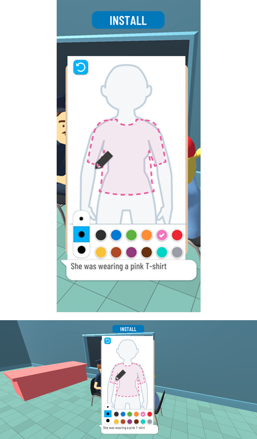
Design Tips
Try to avoid layouts that "kind of work" in landscape or portrait - you should optimise your layout so that it looks great regardless of orientation.
Test your gameplay in both orientations and ensure that there are no edge cases that occur when the resolution is outside the usual range.
Don't stretch call to action buttons to match the screen width.
Consider including additional UI in landscape mode, for example you can add the game's icon in the top left corner to fill some unused space.
Tutorial
As you will read in our design guide for engaging he user, the tutorial is the most important part of your playable experience.
Your tutorial should be designed to engage the user, and ensure that they start your playable experience. To do this, you will need to offer some visual hints and guides so the user understands what to do in your playable. Text overlays, finger icons and dummy-moves are all natural ways to do this.
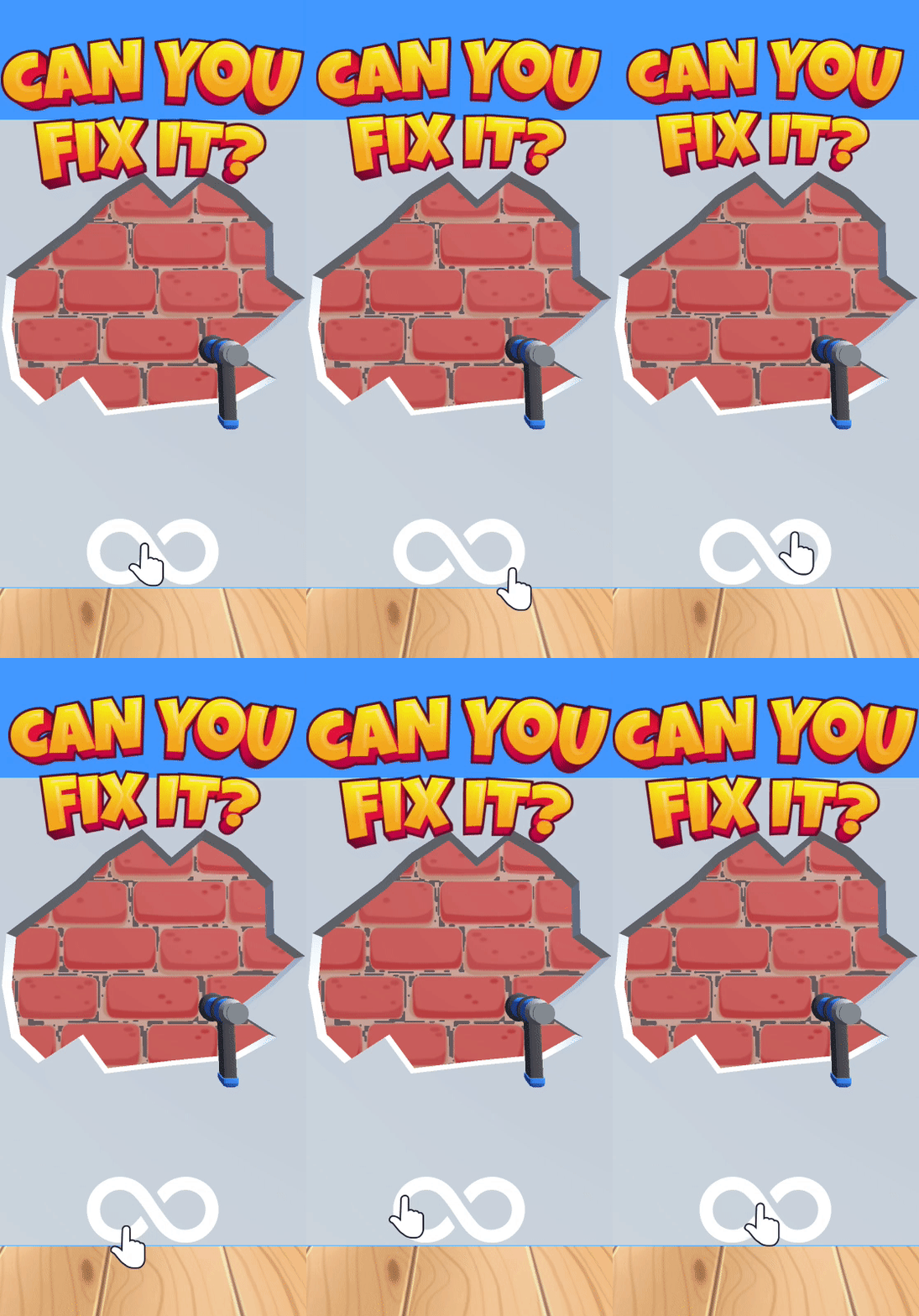
Design Tips
Use animated fingers to highlight how the user should interact the ad i.e. swipe, tap, move.
Have a clear message or hint to the user letting them know what the goal is for the playable. As you can see in this example, "Can you fix it" lets you know that you should try to fix the wall.
Use arrows/highlights - if the user needs to get to interact with a certain part of the playable scene, you can use arrows or masks to draw attention to the right place.
In-game hints and motivators
As you will read in our design guide for guiding the user, you do not want to create an experience where a user can be left unsure of what to do next. What may seem obvious to you, you should remember that you built the game and have played it hundreds of times; this will be the first time many users experience what you have to offer!
Include hints and tips to keep you user engaged and motivated, and ensure that they reach the end of your ad where they can click to the app store.
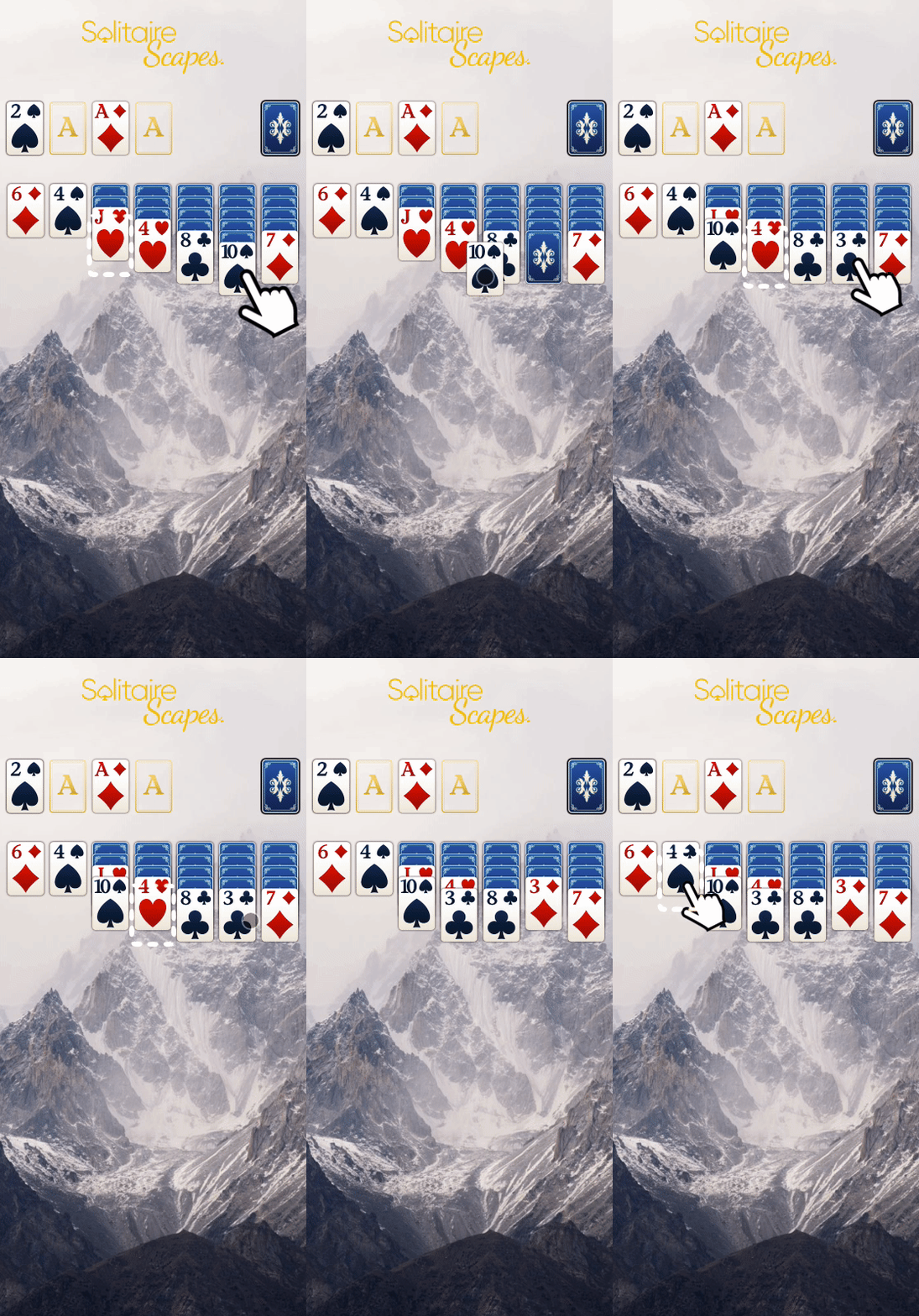
Design Tips
Introduce reminders or tips in the playable the user doesn't interact for more than a certain length of time.
Show positive/negative reinforcements, giving visual feedback to the user i.e. a smiling or sad emoji, or "wow" and "boo" messages.
Use visual fx to reinforce the correct interactions i.e. particles.
Persistent CTA
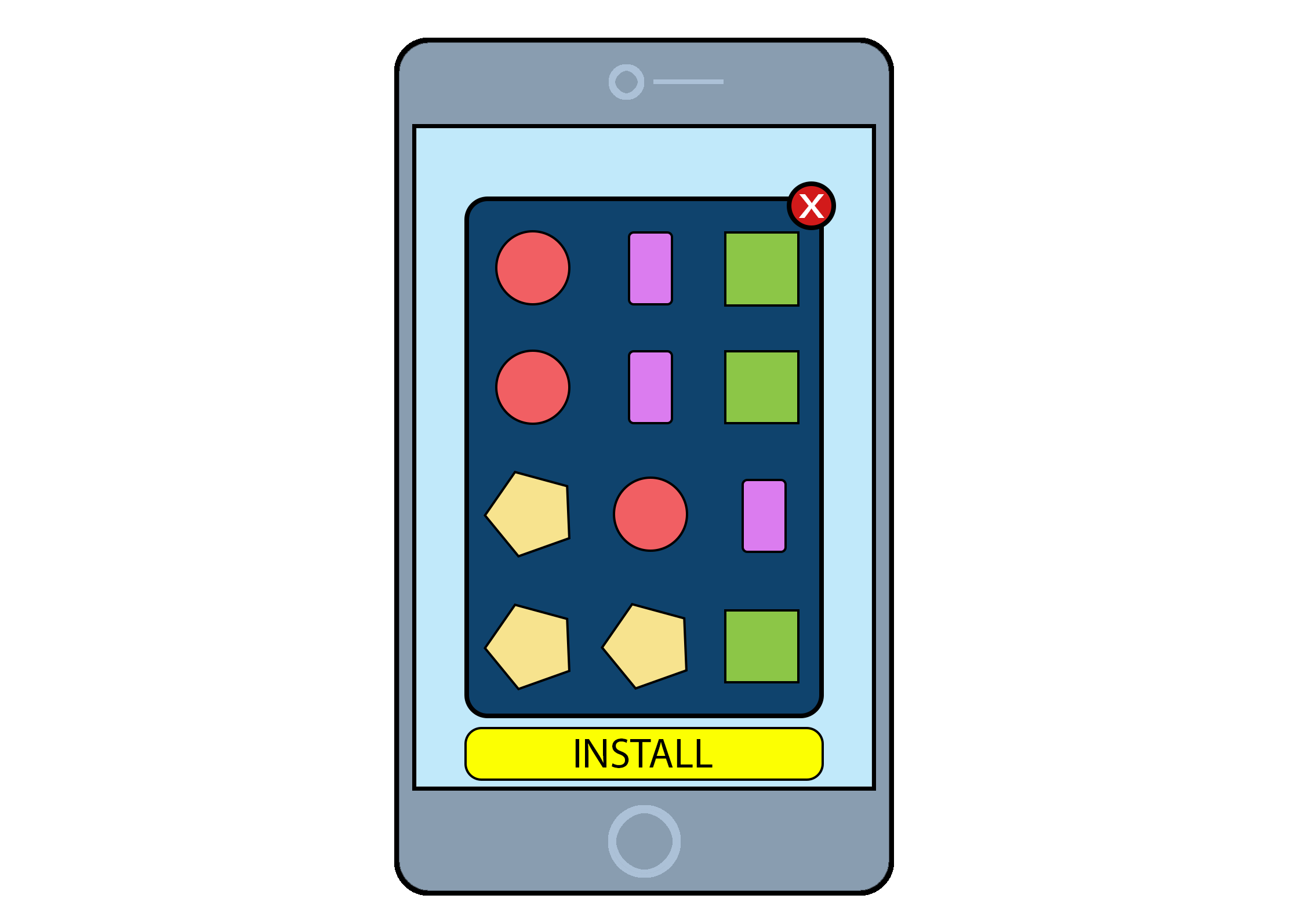 There should be a clear CTA throughout the playable experience. Typically this will be across the top or bottom of the ad, and sometimes in one of the corners. Make sure you place the CTA appropriately so to avoid accidental clicks.
Some ad networks require this in order to run a playable on their inventory.
Replay or try-again
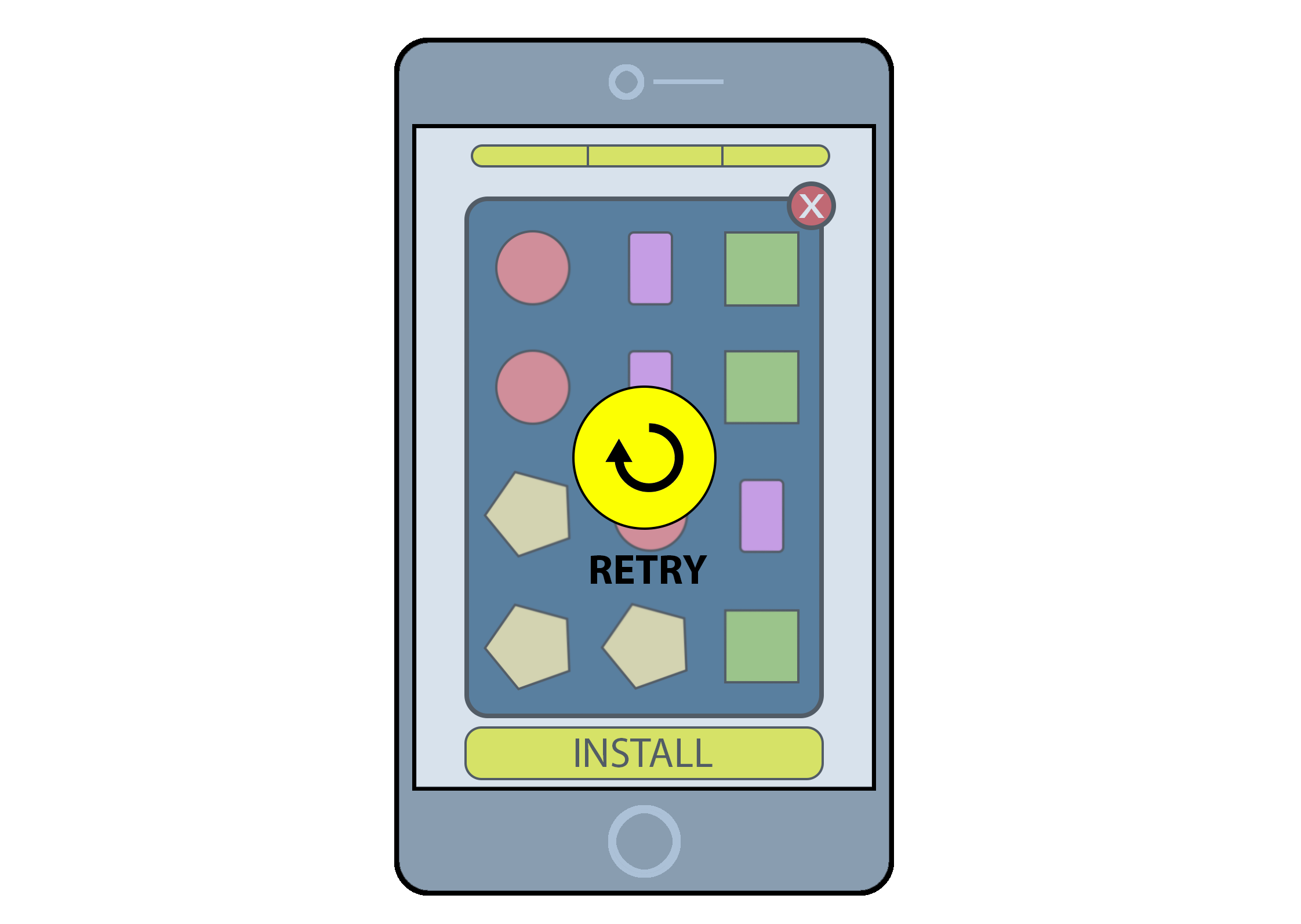
Just as with your full game, users may take 2 or 3 attempts before they're able to win a level. Give them the chance to try again before having to exit the playable. But be careful with giving them too many chances - ultimately you want them download and try out your full game.
By using Unity Playworks, you can easily configure your playable to quickly test the number of retries a user has when engaging with your playable. See more about Playground Attributes.
End Card
When a user has completed the playable, it is recommended to display a full screen CTA along with a message, for example a congratulations, a summary of their gameplay or their score.
You can either use this as an exit point of your ad, triggering a click to the app store when the user interacts, or you can trigger the click during the gameplay and show this end card immediately afterwards.
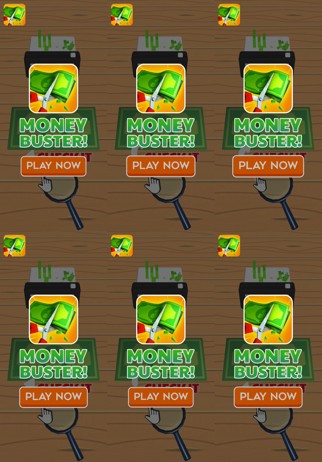
Design tips
Use animations to draw the user's attention to the call-to-action.
Show some branding (app logo or app name) for consistent experience with your app store page.
Make the whole screen clickable.
Experiment with different styles. For example, you can use a standard end card as shown to the left. Or alternatively, you could use one of the following: a) Choose your next...: allow the user to pick from 2 or more items such as level, character, weapon etc.
b) Next level: show the gameplay for the next level start screen and add an overlay tempting the user to play.
c) Upgrade: offer the user the chance to upgrade after winning the level.
d) Retry: offer the user the chance to play again after failing.